One critical aspect of brainstorming and other idea-gathering processes is that one must not judge the ideas as they are presented. After that gathering phase, though, the ideas are useless if no patterns or relationships can be discovered. One good solution for that is the Affinity Diagram.
Wikimedia CC0
The process was identified in the 1960s by Jiro Kawakita, a cultural anthropologist, and sometimes referred to as the "KJ Method" (reflecting the order of given and family names in Japan). The affinity diagram is one of a group of techniques often called the "Seven Tools".
The idea of the affinity diagram is simple. Participants in a session share ideas about some general topic. The topic may be business analysis, an after-action discussion from a marketing campaign or event, verbal survey responses, or virtually any text-based data If there are many ideas, it is essential that they be organized for them to be meaningful. In some cases, the ideas or concepts are gathered in advance of the organization process.
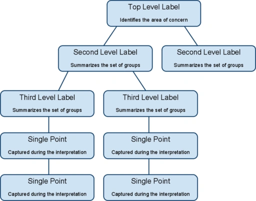
To create the affinity diagram the participants group ideas based on how they believe the ideas (referred to as "points" in the image above) interrelate. Traditionally the text was written on note cards or "sticky notes" and moved around a large wall or on multiple flip chart pages. In many cases that process has been replaced by presentation software projecting the ideas on a screen for all participants to see. A single projector, however, is often unsuitable for classifying a large number of ideas.
It is essential that the group remain silent during the classification step to avoid influencing each other. The silence also creates a safe and non-judgemental atmosphere.
After all, (or all but perhaps a couple) of the points are placed into groups, participants may discuss the placing of the items. This may be necessary if the placement of an idea is controversial if an idea needs to be in two or more groups, or if the classification process leads to new ideas.
Once the points are grouped, the diagram will look something like this:
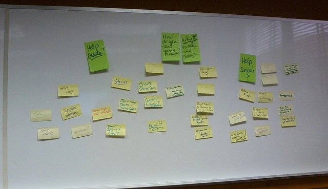
Flickr.com Deb Nystrom
There are a few important points to note about the creation of the diagram:
- In many cases, there are no third level labels. These are mostly used when many points are captured.
- The group should agree on any second or third level labels.
- Participants may move the points between labels, and some points may belong to two or more labels. In the latter case, the facilitator will create a copy of the information so one copy can be placed below each label.
The diagram is not the end of the process, though! It is designed to lead to action. The action taken on the groups depends on the topic, of course. The ideas may lead to business process changes, improved communication, or even improved product design.
I have personally used the affinity diagram tool to: help examine successes, failures, and potential changes after an annual event, discover ways to market products, organize content for publication, and create task groups to further address issues.
The affinity diagram is another facilitation tool I enjoy using. It is different than the PMI tool I wrote about earlier because it groups items not by a pre-defined limited set of categories, but in a more general participant-determined way. Each technique has its place, and I hope you will be able to use affinity diagrams in your facilitation of categorization.
AUTHOR: John McDermott